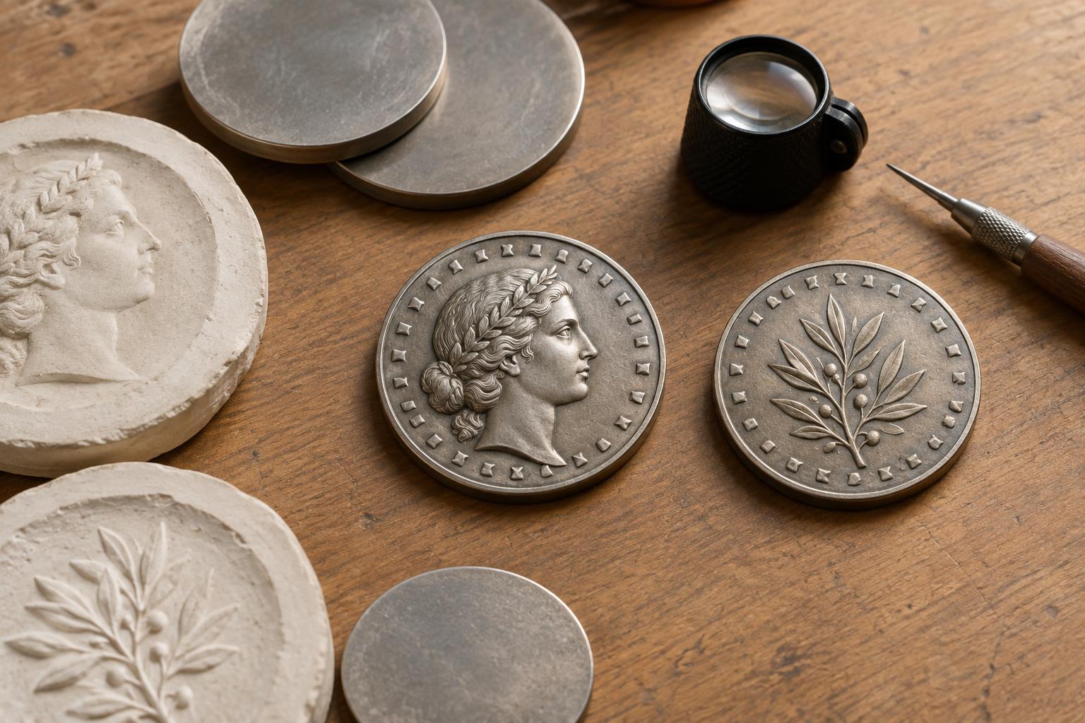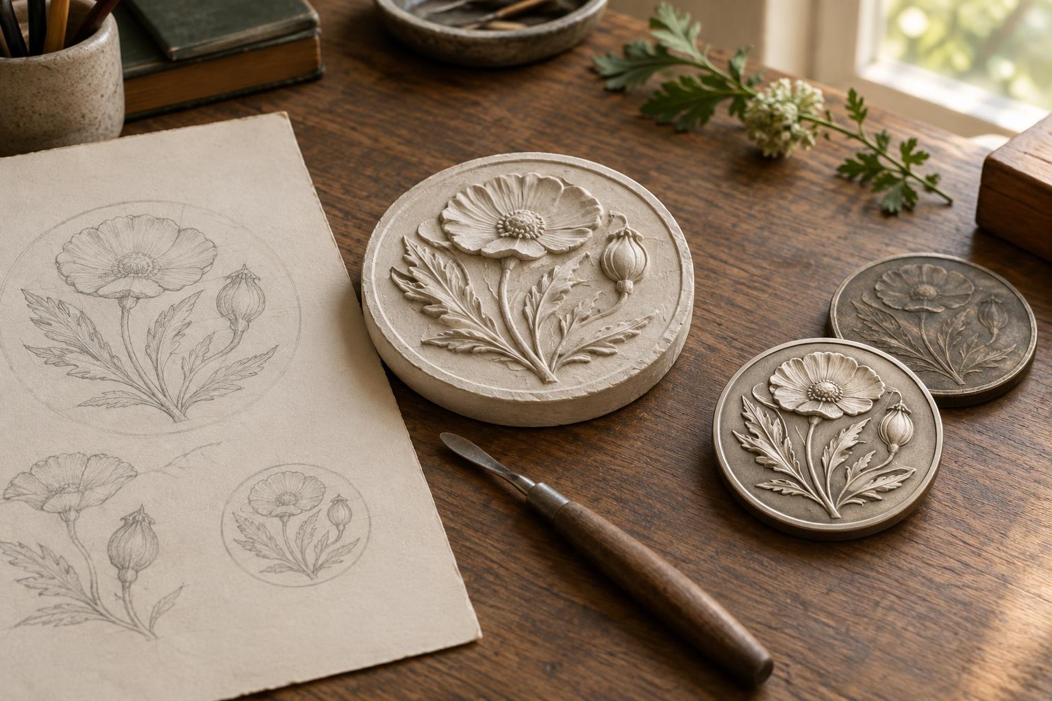
A portrait has to work at coin size
A coin portrait is not simply a small drawing of a face. Its features must remain recognizable after the design is cut into dies, struck into metal and viewed without magnification. The artist also has to share a limited surface with lettering, a date, symbols and sometimes a mint mark. What looks expressive in a large sketch may become crowded or indistinct on a coin.
Collectors often call the main portrait side the obverse, although coin designs do not always follow a simple portrait-on-one-side pattern. When examining a portrait, start by looking at the whole side rather than the face alone. Notice how much room surrounds the head, where the lettering sits and whether the portrait seems to project into the open field, the relatively plain area of the coin.
Why profiles are common
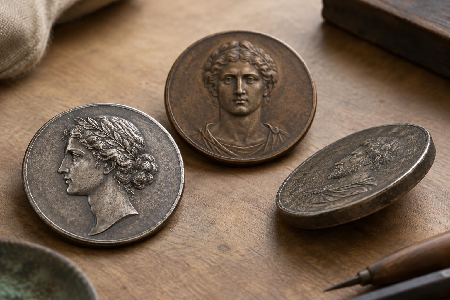
A profile shows the head from the side. Its outline can communicate a great deal with relatively few shapes: forehead, nose, lips, chin and the back of the head each help form a readable silhouette. This makes a profile useful on a small round surface, where subtle facial modeling can be hard to see. Hair, clothing or a headdress can add identifying detail without requiring both sides of the face to be shown.
Profiles also leave useful space. If a head faces toward one edge, the designer may place a name or other inscription around the rim or in the field behind it. The exact balance varies: a large head may feel imposing but leave little room for words, while a smaller head may give the design more breathing space. Neither approach is automatically better. Each directs the viewer’s attention differently.
For collectors, the silhouette offers a quick way to compare designs. Look at the distance between the nose and the rim, the shape of the neck truncation and the space around any hair or headwear. These choices can make two portraits of the same person feel quite different.
What changes in a facing portrait
A facing portrait looks toward the viewer, either directly or at a slight angle. It can create a strong sense of presence, but it asks the designer to describe both sides of the face within the same small area. Eyes, nose, mouth and cheeks must be separated clearly enough to read as a face without turning into a cluster of fine lines.
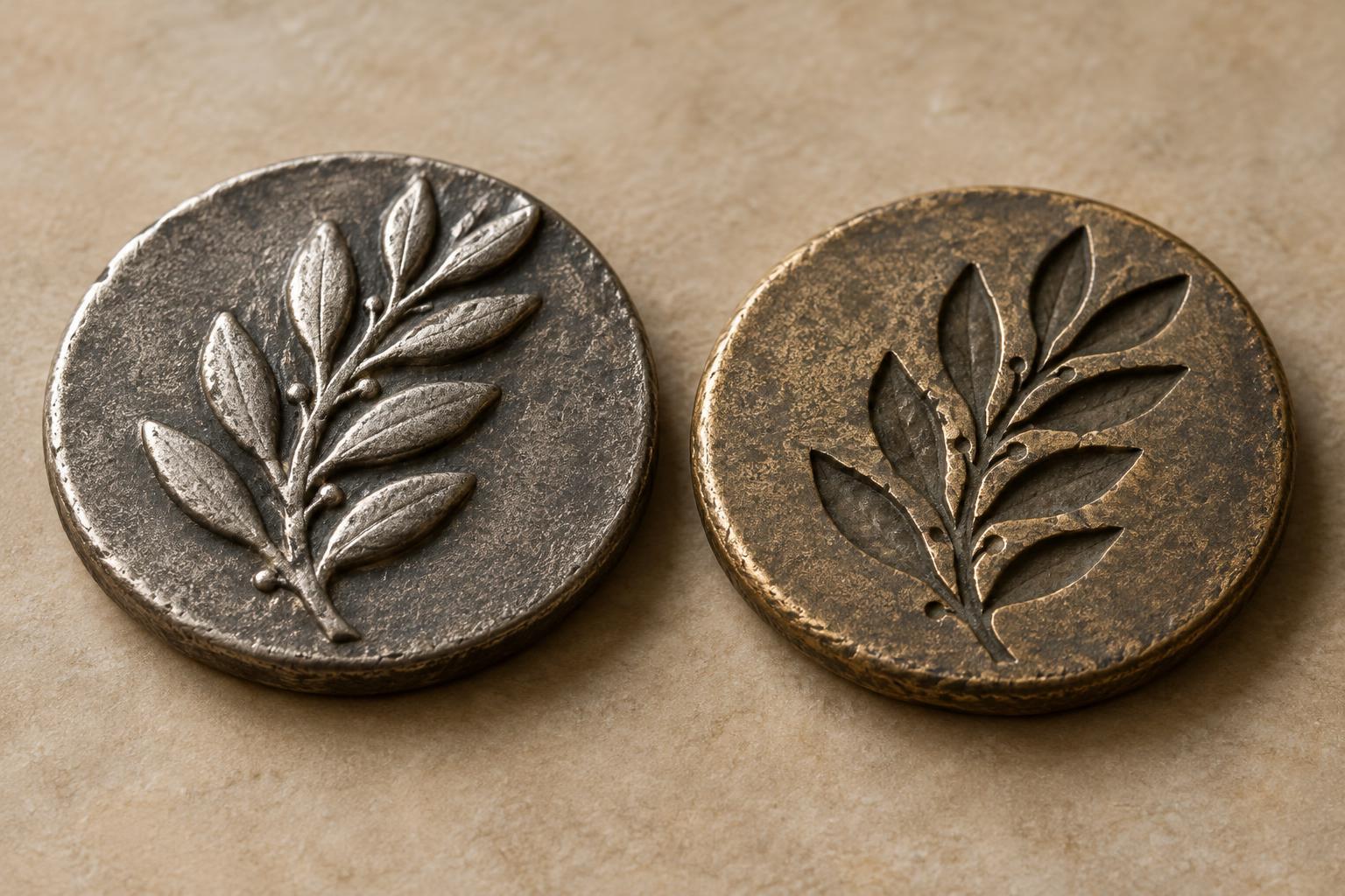
Lighting is part of the challenge. On a struck coin, raised and recessed areas catch light differently as the coin tilts. A profile can rely heavily on its outer edge; a facing view depends more on the relief within the face. If the modeling is too shallow, features may appear flat. If important details are too fine or crowded, they may be less apparent on an ordinary circulated piece. A facing portrait may therefore use simplified, deliberate shapes rather than every detail an artist could include in a larger work.
A portrait turned three-quarters of the way toward the viewer falls between these approaches. It can show more of the face than a profile while retaining a strong contour on one side. It also creates its own balancing problem: the near side and far side of the face must look convincing without competing with nearby lettering.
Space, relief and the rim
The rim forms a practical boundary for the composition. A portrait placed close to it can appear dramatic, but an eye, chin or headdress near the edge may have little room to stand apart from the border. Lettering around the edge needs separation too. If letters and portrait details press against each other, the design can feel busy even when every element is individually well drawn.
Relief—the height and shape of the raised design—also affects what fits. A dramatic portrait with pronounced modeling may be visually appealing, but its details must be suitable for the intended coin and striking process. Designers and minting specialists may adjust shapes so metal can flow into the die’s recesses during striking. The goal is not necessarily to make every feature equally bold; it is to give the most important features a clear hierarchy.
How to look at portraits in your collection
Choose two or three coins with portraits and compare them under the same light. First, identify the viewing angle: profile, facing or three-quarter. Then cover the lettering with a finger and ask whether the face remains easy to recognize. Finally, look at the open field and the gaps between the portrait, inscriptions and rim. This simple exercise reveals how much of a portrait’s success depends on space around it.
Try tilting each coin gently to see which features catch the light. On a worn example, note which details remain clear and which have softened; wear can change how a design reads, so avoid judging the original artwork by a single heavily worn coin. Comparing portraits this way turns a familiar collecting subject into a study of practical design choices.