A small surface with several jobs
A coin may need to show who issued it, what it is worth and when it was made. It may also carry a portrait, an emblem, a motto or a commemorative design. Designers must fit these elements onto a small metal surface without making the result difficult to read. Lettering is therefore part of the composition, not information added after the artwork is finished.
Collectors often use legend to mean an inscription that identifies an issuing authority or names a person or place. A motto is usually a short phrase with symbolic meaning. The date identifies a year associated with the coin’s issue, though its precise significance depends on the coin and its issuing system. These terms help describe what appears on a coin, but they do not dictate where each element must go.
Why inscriptions often follow the rim
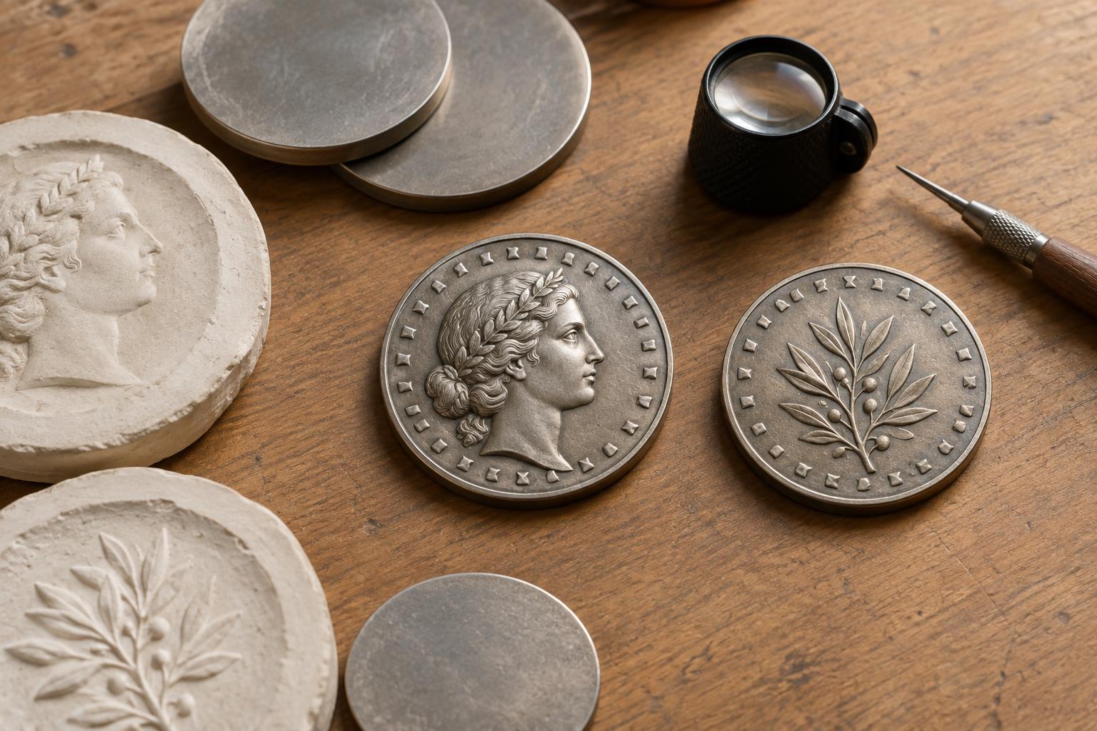
Curved lettering near the rim makes use of space that might otherwise frame the central image. It can leave room for a portrait, building or emblem while giving the inscription a clear path for the eye to follow. A designer may place one phrase across the top and another across the bottom, or interrupt a longer legend with small marks or design elements.
The rim is not unlimited space. Letters need enough separation to remain distinct, and they cannot crowd a raised border so tightly that they become hard to see. A long inscription may call for smaller letters, abbreviations or a different arrangement. On a small coin, a short phrase in clear lettering may communicate more effectively than a fuller phrase compressed into the same area.
Balancing words with the central design
Placement affects what a viewer notices first. A date beneath a portrait can act as a visual anchor; a motto beside an emblem may connect the words to that image. Symmetry can make a design feel formal, while lettering placed in open areas around an irregular image can keep the whole surface balanced. Even the spacing between words contributes to the coin’s appearance.
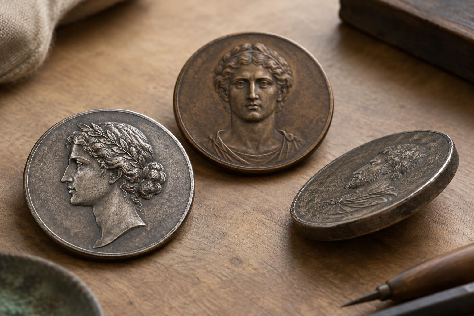
Designers also have to consider raised relief. A large portrait or bold symbol may leave little room for inscriptions without awkward overlaps or cramped gaps. Lettering can be moved to the other side of the coin, set in a band, or incorporated into a less prominent part of the design. The obverse and reverse work as a pair: not every identifying detail has to compete for space on one side.
How minting changes the plan
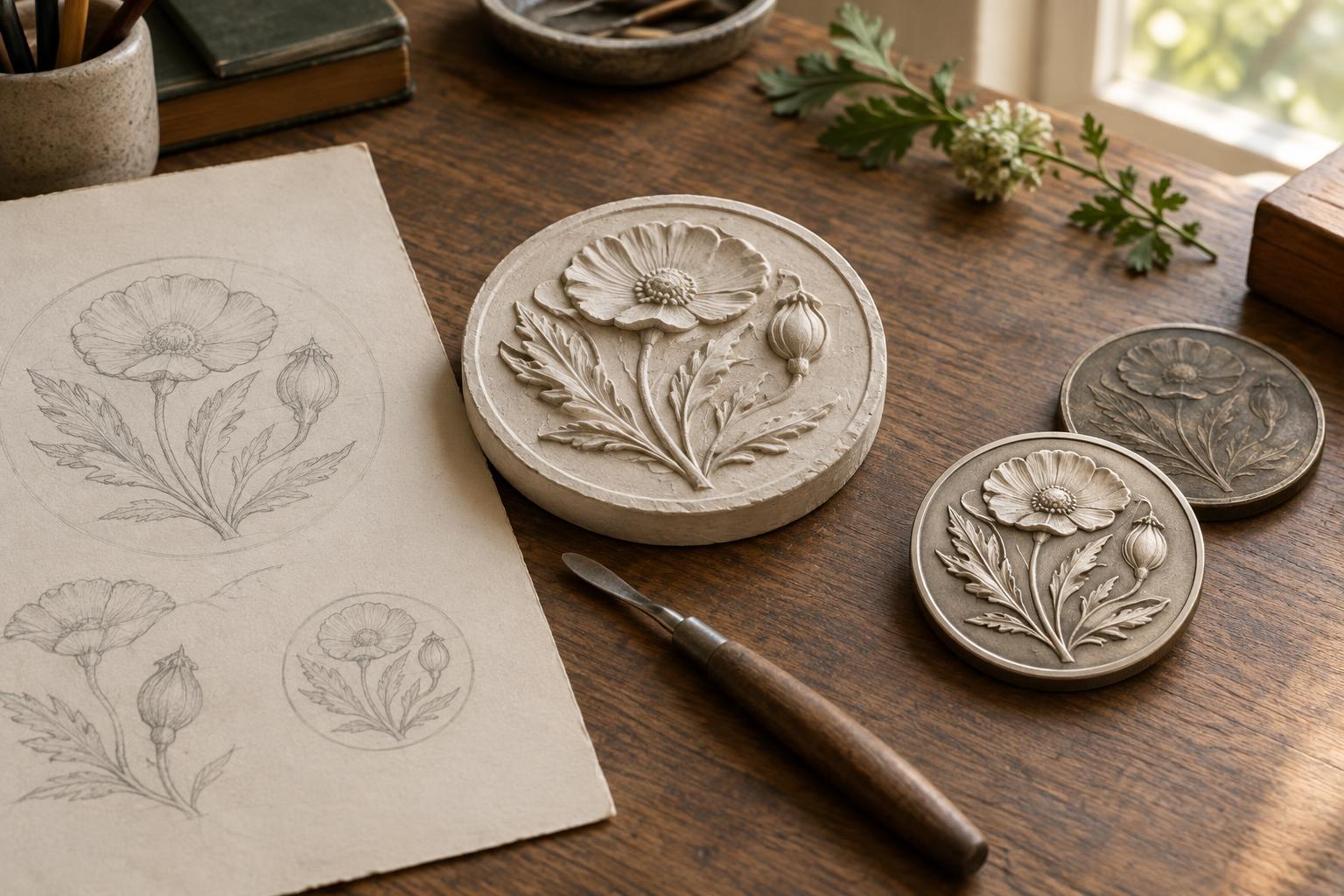
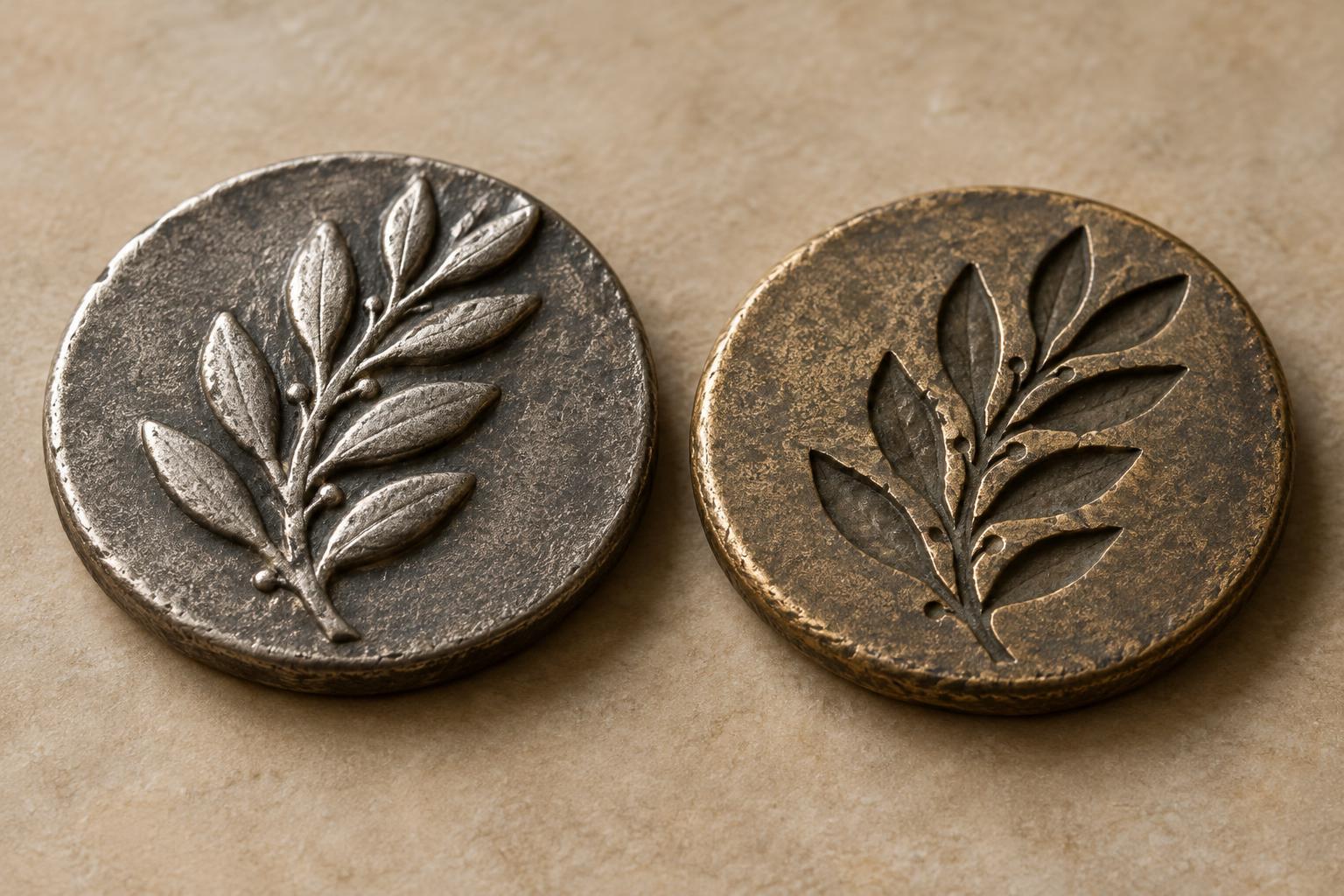
A coin design must be made into dies that impress its details onto metal. Very fine strokes, tightly spaced letters and abrupt changes in relief may be less practical than they look in a drawing. The size of the coin, the metal and the intended finish can all influence how confidently small lettering will appear. Designers and minting staff may adjust an inscription’s size, depth or position so it remains recognizable on struck coins.
The edge offers another possible location for words or marks, although edge treatments require suitable production methods. On coins with edge lettering, moving a phrase off the main faces can free space for imagery. It also gives collectors another feature to examine. The edge should not be overlooked, but it is not a substitute for checking the two faces: each location serves a different visual purpose.
Reading the arrangement as a collector
When examining a coin, start by locating its date, denomination and issuing name or symbol. Then look at how any motto relates to the central design. Is the wording arranged in a continuous arc, divided into groups, placed in a straight line or moved to the edge? Consider what that choice makes easier to see and what it allows the designer to emphasize.
Compare several coins of similar size rather than assuming there is one correct layout. You may notice that some designs give priority to a portrait, while others make lettering a prominent feature. Also distinguish an intentional design choice from later wear: high points and small letters can lose clarity through circulation. Looking closely at where words sit—and how much space they have—turns a familiar coin into a lesson in design and minting.